
Eliza
Eliza is a patient engagement management portal – a system used by Health Maintenance Organizations (HMOs) and pharmaceutical companies to track communication with patients. Despite a recent overhaul, users found it cumbersome and difficult to use. A user-centered approach was needed to better align the design to its user’s mental model.
As experience designer my responsibilities included: Understanding the needs of the business and the product’s users through research
Understanding the issues in the current product through usability testing in order to identify areas of attention for the new design
Building cultural buy-in to support a user-centered environment at Eliza, through persona development
Producing a clear information architecture and wireframes that highlight and support the key tasks of the user
Key objectives
We ran a stakeholder workshop to understand the different perspectives of those involved and found the goals of the project to be:

Increase user engagement

Decrease support calls

Surface key information faster

Keeping the user present
In order to keep a user-centered mentality at Eliza, we recommended keeping the user present at all times. Once we had done a persona workshop with the product team (to understand who they felt the user was) and user interviews (with actual users) we produced a set of persona posters to make the users feel more familiar with the product team.

Identify pain points
We began tackling the project by first looking at the offending existing application. We performed a usability test, asking actual users to perform their key tasks. This helped us to identify what they valued, what they hated, and what they really liked so that we didn’t throw the baby out with the bathwater.
Rethinking the task flow
A card sorting activity was done with users in order to better understand the way they grouped concepts and terminology. This informed the organization of the information architecture and the wireframes.
Starting with a good foundation
Once the key tasks and pain points were understood, I produced all wireframes with annotations to deliver to their internal development team but not before our visual designers worked their magic

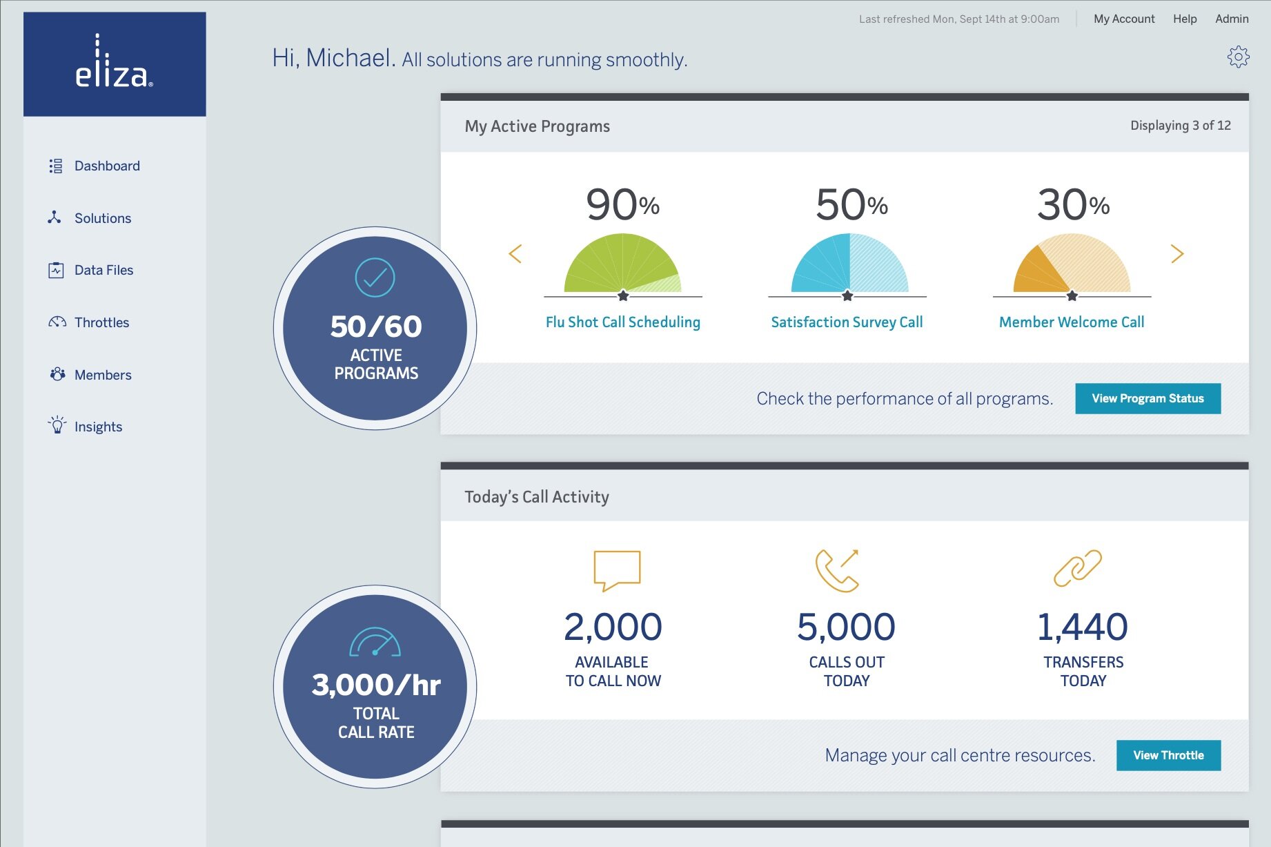
Dashboard

Program status
Making complex look easy
The final solution really captured and brought forward the key pieces of information organized in a way that matched the user’s mental model thus reducing support calls.

Visual design by Jessica Murray
Dashboard

Program status